Scatter Plot
To create a Scatter Plot after a Probabilistic Analysis:
- Select Plot Scatter
 from the toolbar or Statistics menu.
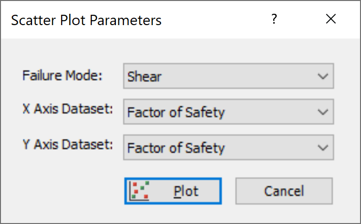
 - Select the Failure Mode (e.g., Shear, Elastic Buckling, Arch Snap Thru, or Compression, whichever is applicable).
- Select the data you would like to plot on the X-axis and Y-axis.
- Select Plot.

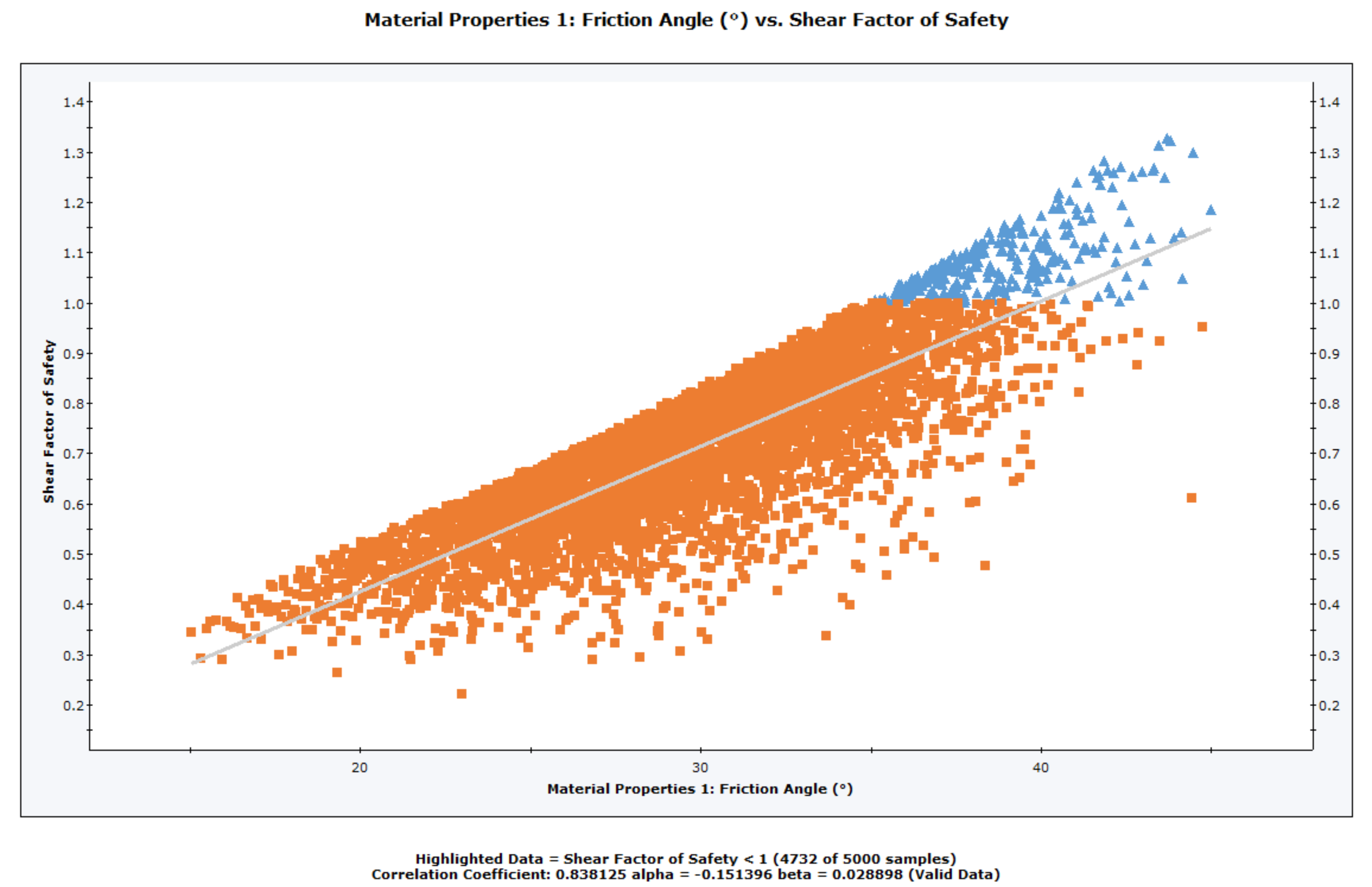
The Scatter Plot will be generated. At the bottom of the Scatter Plot, you will see a listing of the Correlation Coefficient, alpha and beta.

Correlation Coefficient
The Correlation Coefficient indicates the degree of correlation between the two variables plotted. The Correlation Coefficient can vary between -1 and 1 where numbers close to zero indicate a poor correlation, and numbers close to 1 or -1 indicate a good correlation. Note that a negative correlation coefficient simply means that the slope of the best fit linear regression line is negative.
Alpha and Beta
Alpha and beta represent the y-intercept and slope, respectively, of the best fit linear regression line to the scatter plot data. The linear regression line can be displayed on the plot with the Regression Line option in the right-click menu.
Right-Click Options
Several options are available in the right-click menu for Scatter Plots, including:
- Show Failed Pillars
- Chart Properties
- Change Plot Data
- Copy Chart to Clipboard
- Copy Data to Clipboard
- Plot in Excel