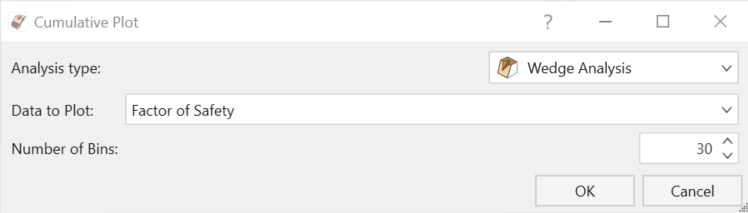
Cumulative Plot
A Cumulative Distribution is, mathematically speaking, the integral of the normalized probability density function. Practically speaking, a point on the cumulative distribution gives us the probability that a random variable will be less than or equal to a specified value.
That is, if (X, Y) is a point on the cumulative distribution S-curve, then Y = the probability that the random variable will be <= X.
To plot a Cumulative Distribution after a Probabilistic Analysis:
- Select Results > Charts > Cumulative

- In the Cumulative Plot dialog, select the Analysis Type (Wedge, Planar, or Toppling).
- Select the Data to Plot from the drop-down menu.
- Adjust the Number of Bins as desired.
- Select OK to generate the cumulative plot.
The sampled mean, standard deviation, minimum and maximum values for the data plotted will be listed at the bottom of the plot.
Chart Data
The following functionality is available in the Chart Data tools:
- Change Data
 prompts the Cumulative Plot dialog to appear, allowing you to change the data viewed on the plot.
 - Chart in Excel
 prompts an Excel application to open with exported data in columns. A chart object duplicating the chart in RocSlope2 will also appear.
 - Copy Data
 allows you to copy and paste the data to another spreadsheet or word file.
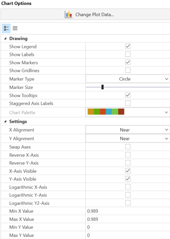
Chart Options
The Chart Options pane on the left side allows you to modify the graph with the drawing/settings of the plot. The drawing section allows you to change the labels while settings allow you to adjust the graph settings such as axis alignment, min/max, etc.
Right-Click Options
Other options are available if you right-click on a Cumulative Plot. For example:
- Select the Change Plot Data option to change the data viewed on the plot.
- Plot in Excel : you can either right-click a chart or click the 'export to excel' button Plot in Excel button in the toolbar. An Excel application will open, and the data will be exported in columns. A chart object duplicating what was in the RocSlope3 will also appear.
- Copy Chart Image
 : this allows you to copy and paste the chart as an image.
 - Copy Data to Clipboard : this allows you to copy and paste the data to other spreadsheet or word file.