If you have performed a Sensitivity Analysis with Slide3, then the results are viewed with the Sensitivity Plot option.
To create a Sensitivity Plot:
Select Sensitivity Plot from the toolbar or the Statistics menu.
In the Sensitivity Plot dialog:
Select the Analysis Method for which you would like to view results.
Use the checkboxes in the Data to Plot area, to select the Sensitivity Analysis variables that you would like to plot.
Select the Plot button to generate the Sensitivity Plot.
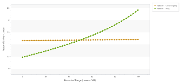
Sensitivity Plot
A Sensitivity Plot is simply a plot of safety factor against the percentage change in specified model parameters. On sensitivity plots, the gradient of a curve for a parameter indicates the effect that parameter has on the factor of safety. Steeper rising or falling curves indicate greater influence on the factor of safety. A relatively "flat" curve indicates that a variable has little or no effect on the factor of safety.
Sensitivity Plot of two variables
Remember that each curve on a Sensitivity Plot is obtained by varying ONLY ONE PARAMETER while keeping all other variables constant (at their mean value).
Each curve is generated by varying the parameter between the user-specified minimum and maximum values, in 50 equal increments, and calculating the safety factor for the Deterministic Global Minimum slip surface, at each value of the variable.
The horizontal axis of a Sensitivity Plot is expressed in terms of the Percent of Range of the variable. This is the relative difference between the Minimum value of a variable (0 percent) and the Maximum value of a variable (100 percent).
If you are only plotting a single variable on a Sensitivity Plot, then the horizontal axis will be in terms of the actual value of the variable, rather than the Percent of Range.
All curves on a Sensitivity Plot will always intersect at Percent of Range = 50%. This always corresponds to the MEAN value of ALL variables.
If the minimum and maximum values of each variable are an equal distance from the MEAN value, then each curve on a Sensitivity Plot will cover the full range of 0 to 100%.
If the minimum and maximum values of a variable are NOT an equal distance from the MEAN, then the curve on the Sensitivity Plot will not span the full range of 0 to 100% (this is done to ensure that the Percent of Range = 50%, ALWAYS represents the MEAN value of all variables, even if the minimum and maximum are not equal distances from the MEAN.)
 from the toolbar or the Statistics menu.